

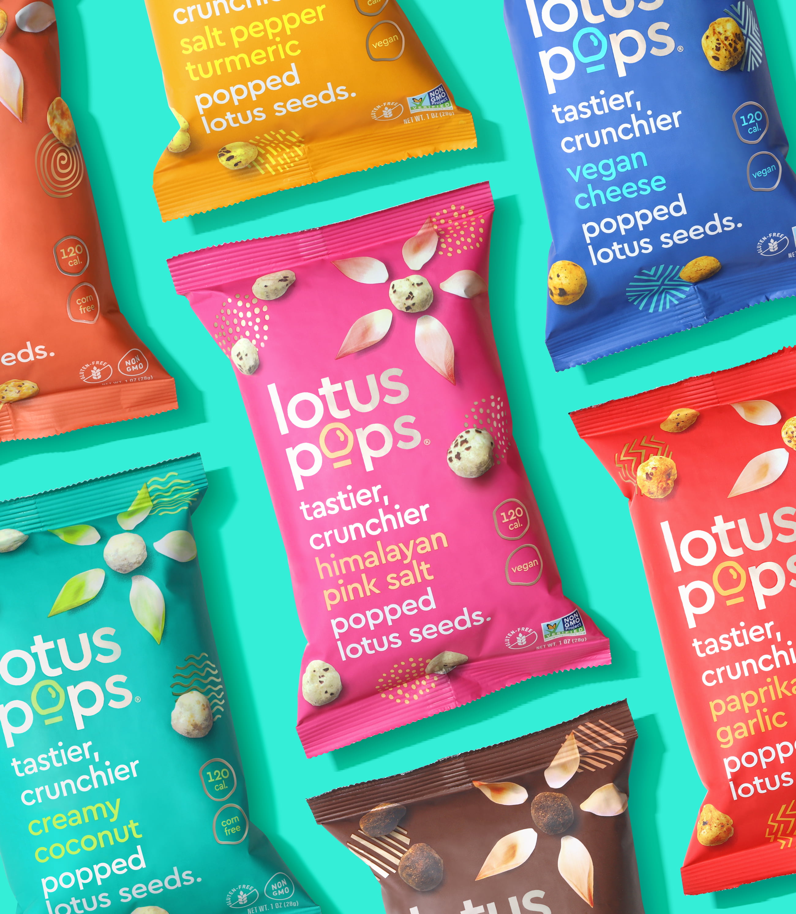


After falling in love with roasted lotus seeds on one of her trips to India, Lotus Pops’ founder knew she had to share this awesome, sustainably grown snack with the world. Riser was engaged to help reinvent the brand language and packaging, elevating Lotus Pops to become the perfectly poppable snacking companion for all occasions.


Working with a totally new kind of snack, we immediately knew that communicating the product’s unique traits would be key to enticing trial. The playful brandmark and illustrative “O” shows off the light product form, while the product descriptor drives home core product attributes. Vibrant colors, kinetic graphics, and a clean layout suggest a modern, yet premium product. The result is a package that literally pops on-shelf.


As a new snack brand, we were at a place where we wanted to make a statement with our packaging. A statement that would convey that we are all about simplicity, quality, and great taste - not just with the product itself but as a brand. Riser was a referral through another company whose branding we greatly admired. After talking to Riser's team and looking at their portfolio of work, we felt confident that we would be in good hands. The before and after result speaks for itself. Riser was very responsive throughout the entire process and very understanding of all the pivots we requested of them. What we now have is great branding that stands out in a crowded marketplace, thanks to Paul and Camila! We know we will continue to work with them for any of our future design needs.Sruti Jilla Founder, Lotus Pops


 NEXT PROJECT