


Nectar is leading the shift to better protein by focusing on taste. Through extensive sensory panels, Nectar delivers clear, actionable insights that help brands improve products, guide distributors, and change perceptions of alternative proteins. As a key player in the field, Nectar empowers smarter, taste-driven decisions for a healthier future.
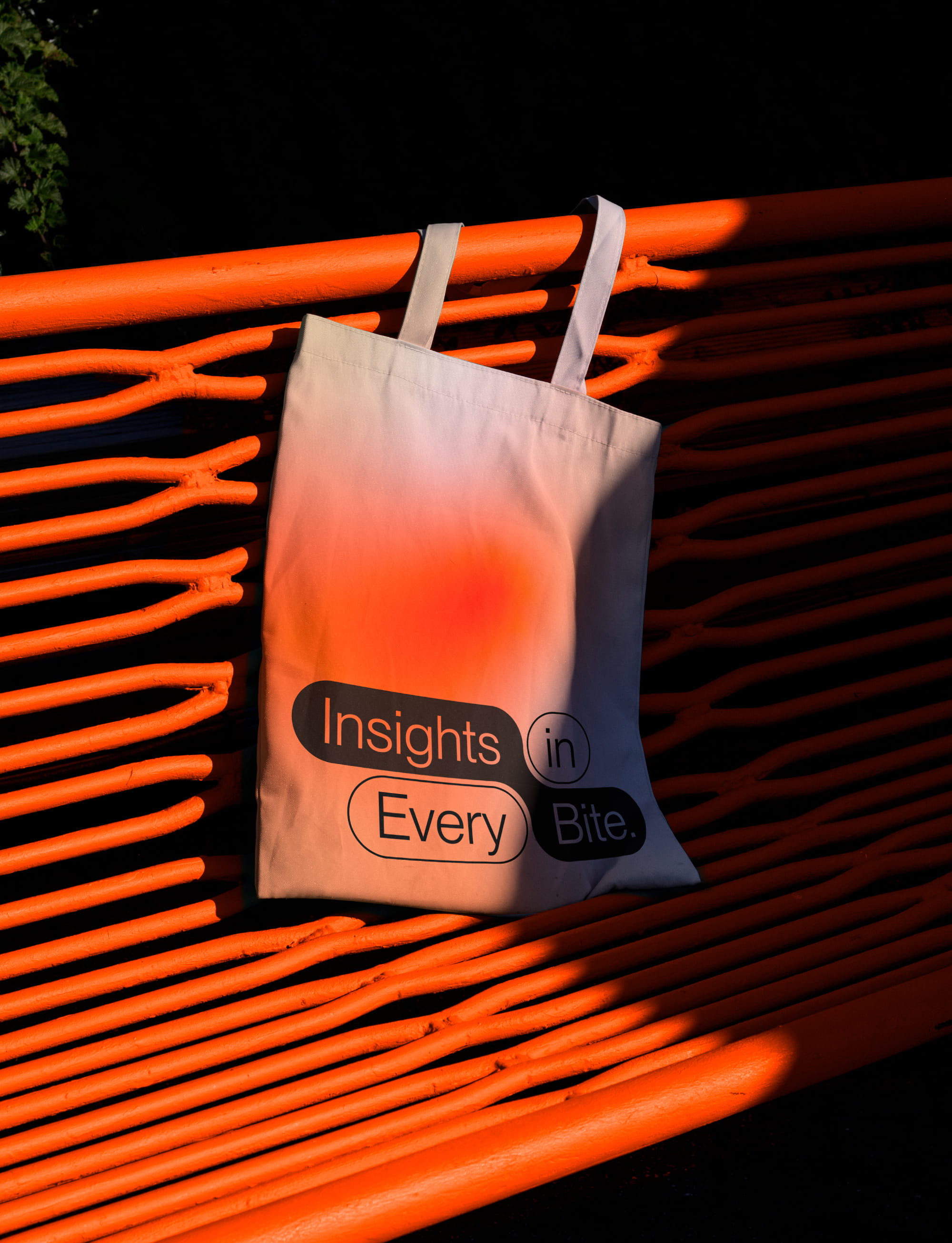
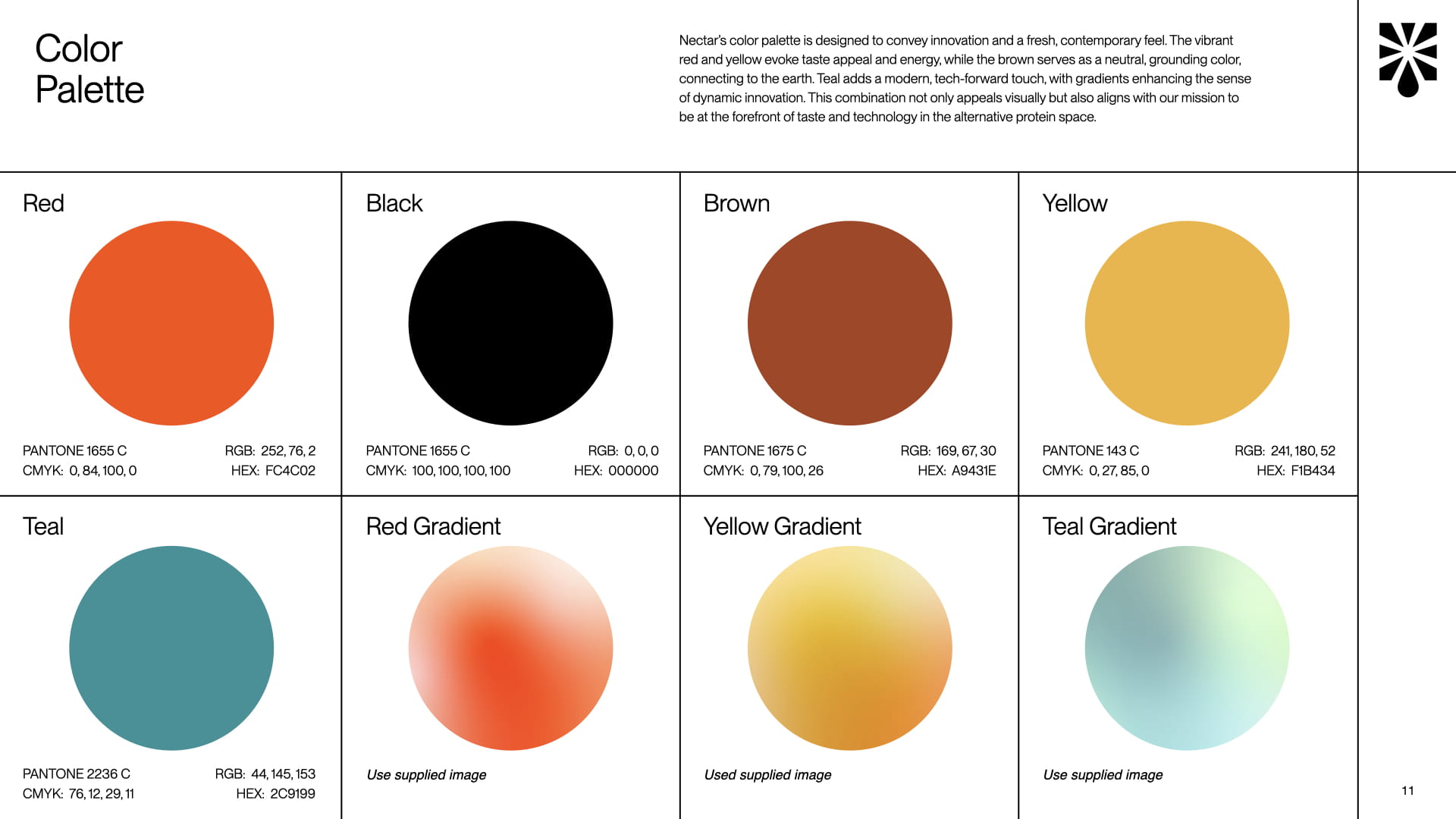
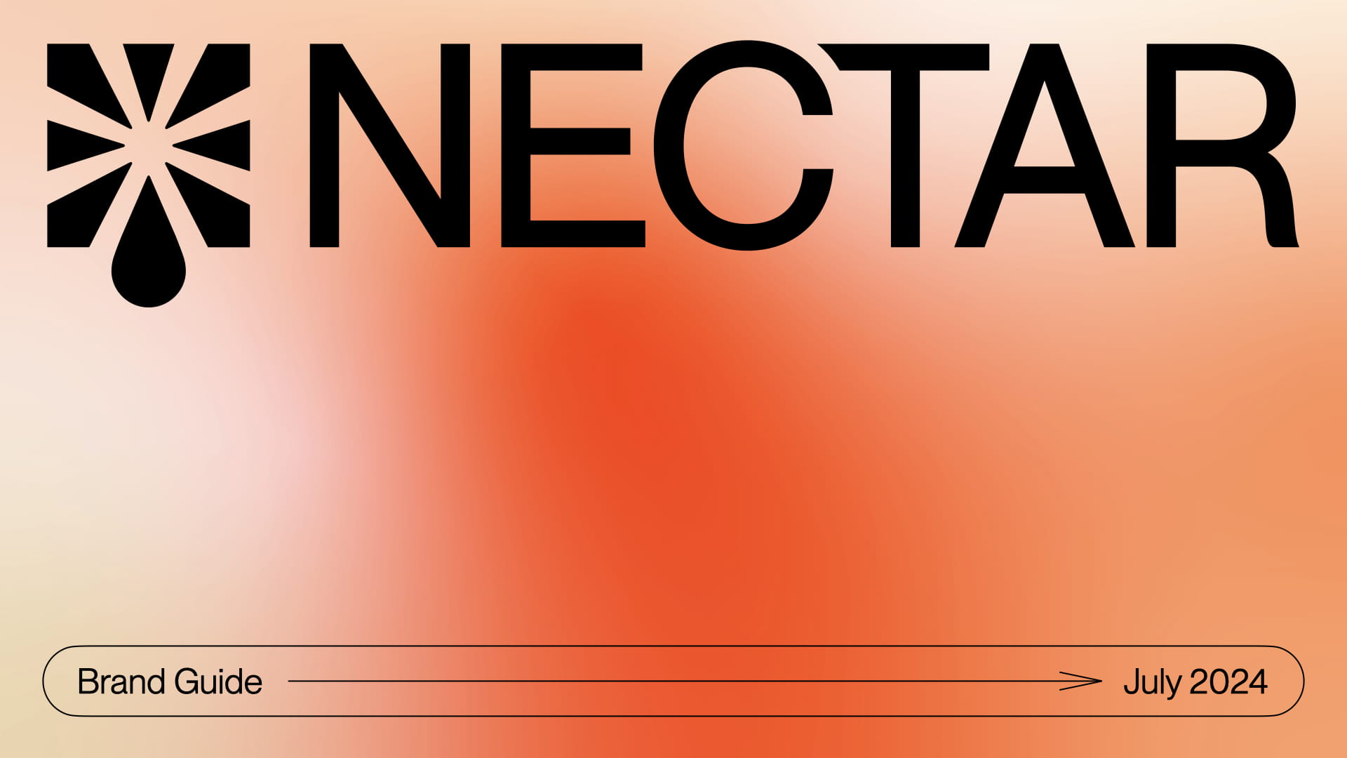
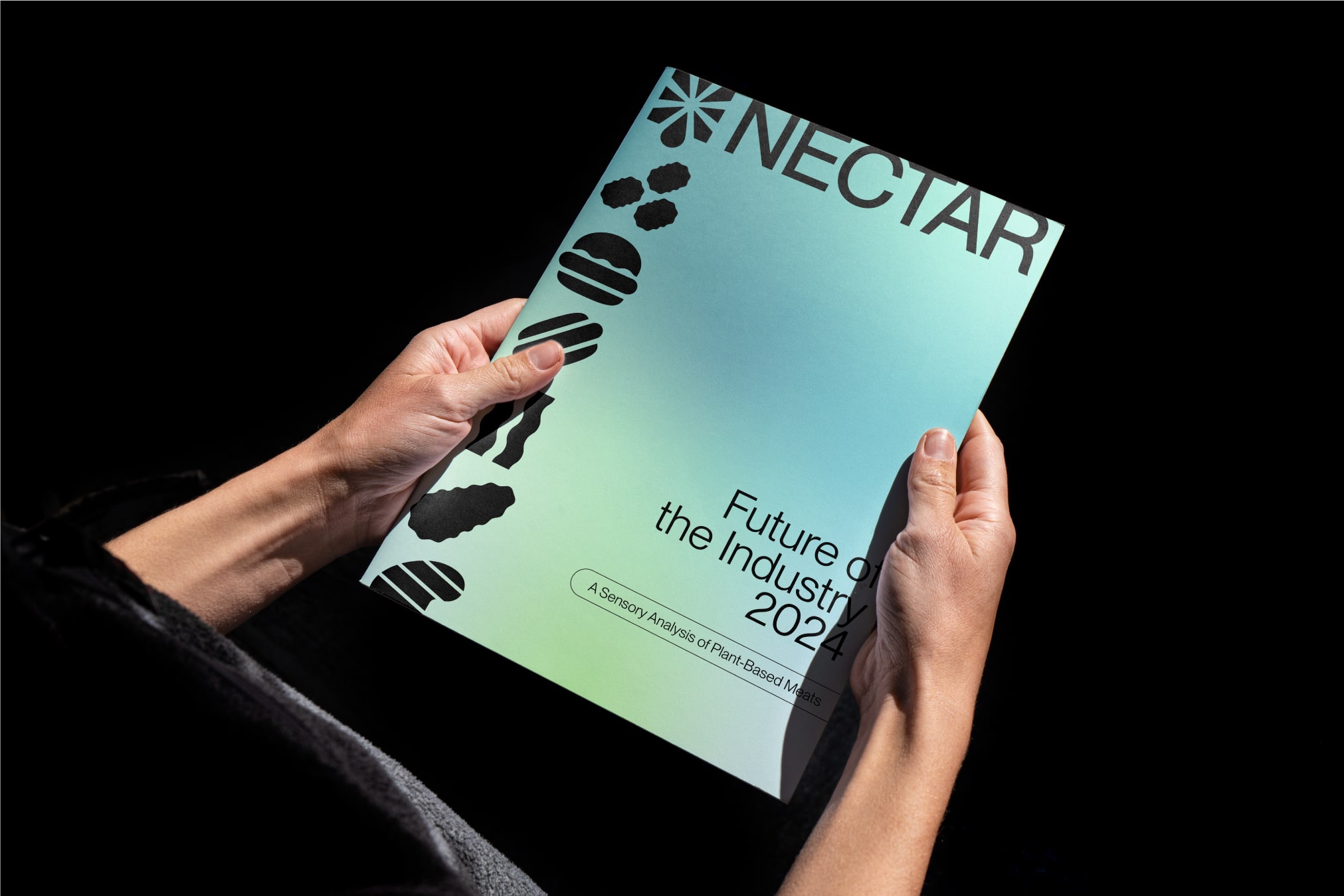
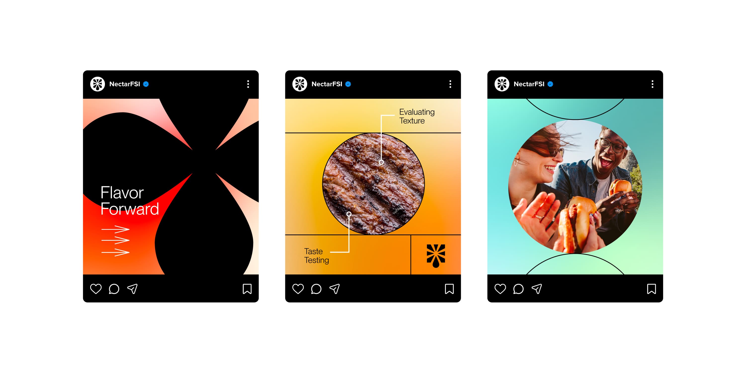
We developed a brand identity that’s bold, innovative, and appetizing. The modern logo, featuring a dynamic drop-shaped icon, captures both freshness and a sense of breakthrough innovation. The icon also subtly reflects a drop of nectar surrounded by rays, symbolizing hope and progress in the alternative protein space. Vibrant reds and yellows emphasize taste, while rich browns and striking teals, enhanced by bold gradients, add depth and modernity, ensuring the brand truly stands out.
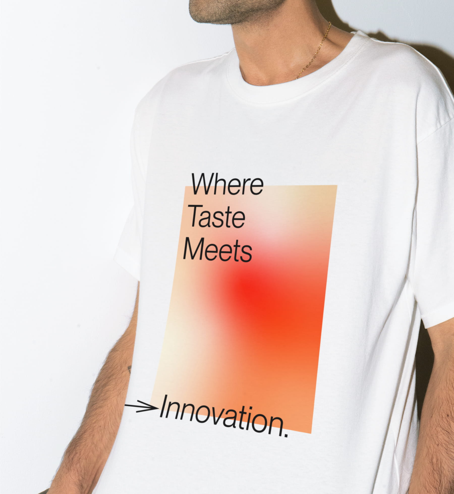
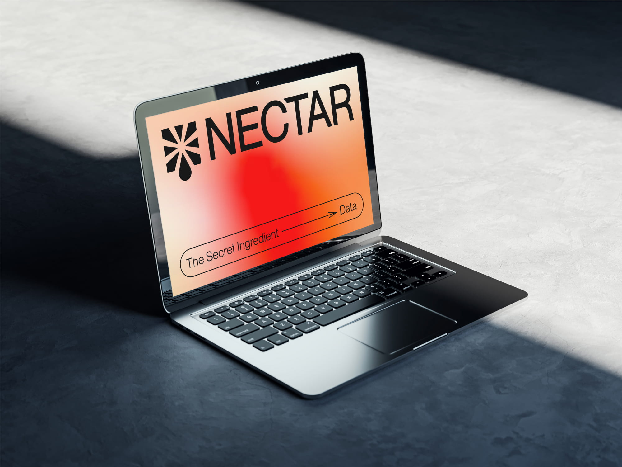

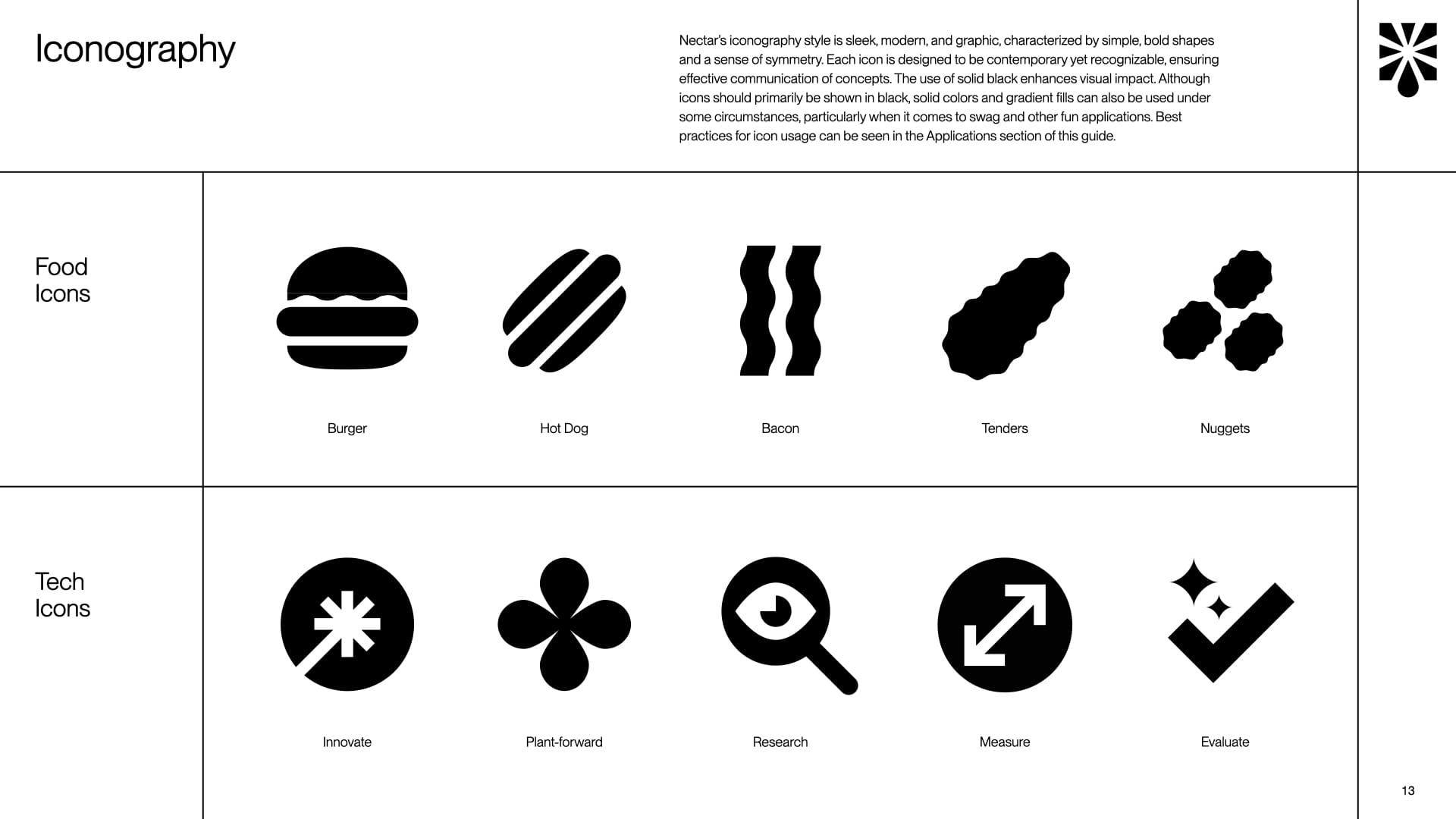
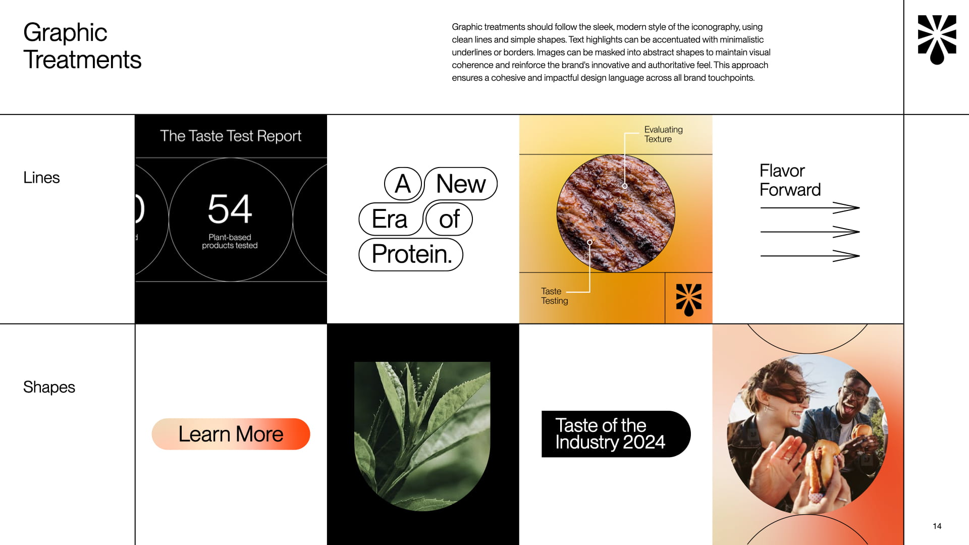
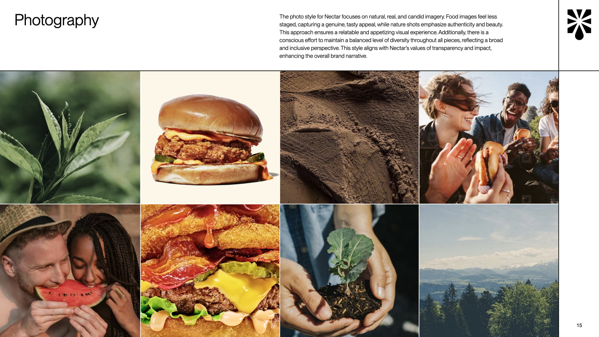
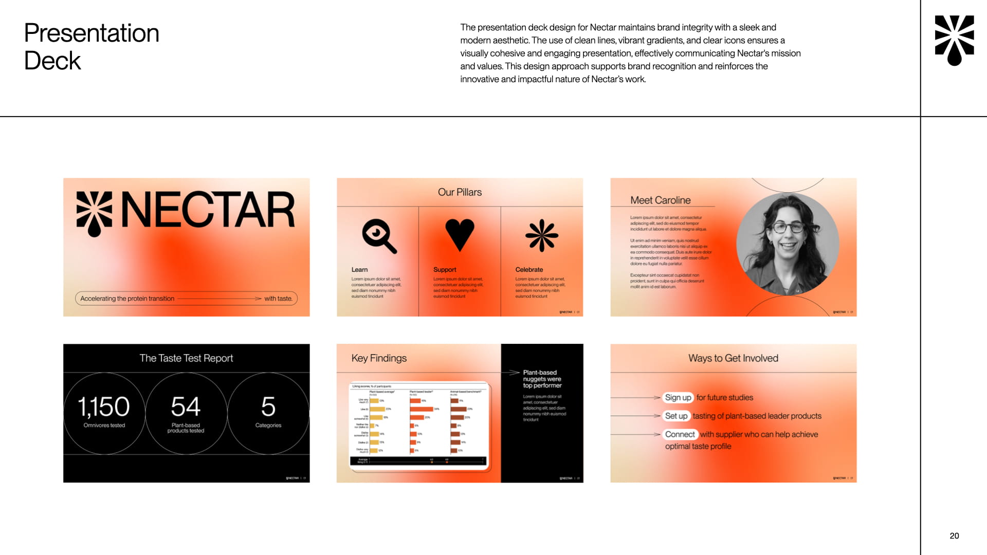
The sleek, modern iconography, paired with clean graphics and candid photography, reinforces Nectar’s leadership in sensory science. This cohesive design ensures strong recognition and resonates with both industry experts and everyday consumers.
 NEXT PROJECT